Design System
Building a mobile design system for Northwestern Mutual.
My Role
UX Individual Contributor
Collaborated With
UX Research, UX Writing, Engineering
Project Duration
2 Years, 2022–Ongoing
Status
Design System in Use


Project Summary
From 2022 to 2024, I worked on Northwestern Mutual's mobile design system, building components, conducting research, and writing documentation. The design system was a collaborative effort, with over a dozen engineers, designers, and researchers contributing. The core team of contributors consisted of me and three other designers.
I personally built 20+ fully responsive Figma components for the design system. Each component was built for iOS, Android, light mode and dark mode. I also was responsible for fleshing out the mobile app's color and type guidelines.
The system saved hundreds of design hours and increased consistency across the app. Today, the design system is used for all mobile designs. All designs moving forward have a source of truth regarding consistent type, colors, and components.
30 Designers Impacted
35 Engineering partners Impacted
3 hrs / week / designer saved in Design Review meetings
4 hrs / week / designer saved in Figma
Increased Design Consistency Across Mobile Org
Designing Components
When designing components, we followed the process detailed below. For some components we were able to skip research; other components required multiple rounds of designs before everyone was satisfied.
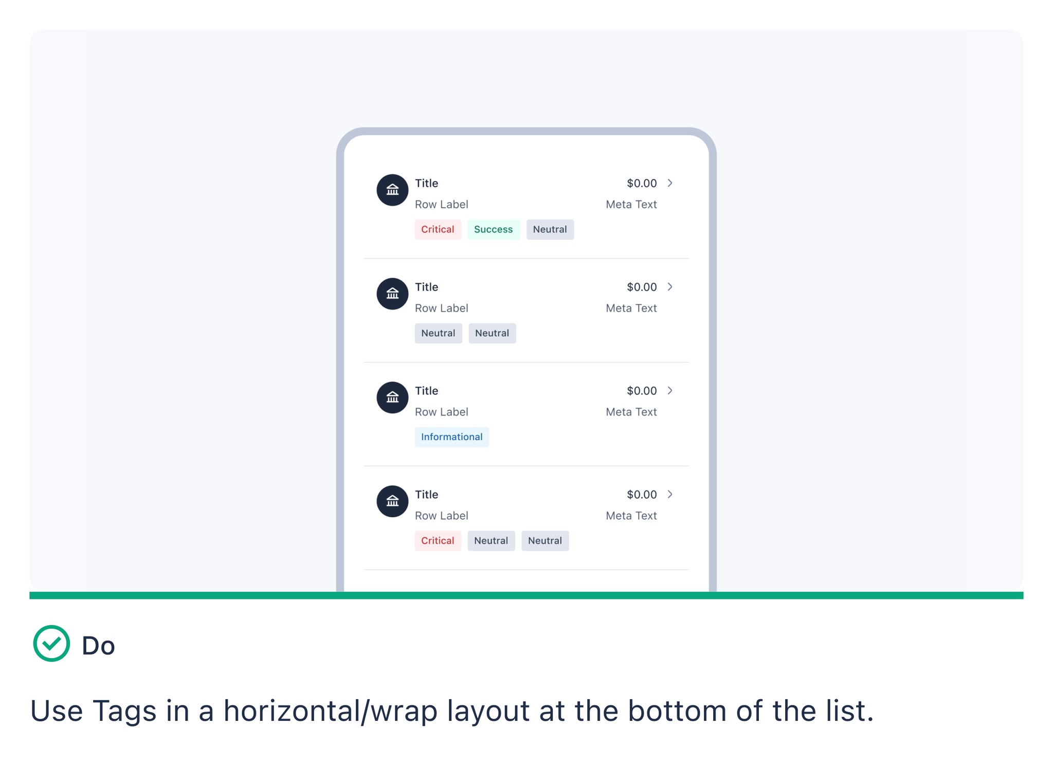
Lists were everywhere in our app, listing accounts, transactions, and users. Each list was slightly different to the next, so we needed one component that could handle all list use cases in a visually consistent manner.
Surveying the App
First, I went through the entire app and found every single instance of a list, taking note of the use case and the visual style. I sorted the lists, taking note of what would be necessary for the new component to replace every single list within the app.
Surveying the App
First, I went through the entire app and found every single instance of a list, taking note of the use case and the visual style. I sorted the lists, taking note of what would be necessary for the new component to replace every single list within the app.
Surveying the App
First, I went through the entire app and found every single instance of a list, taking note of the use case and the visual style. I sorted the lists, taking note of what would be necessary for the new component to replace every single list within the app.
Surveying the App
First, I went through the entire app and found every single instance of a list, taking note of the use case and the visual style. I sorted the lists, taking note of what would be necessary for the new component to replace every single list within the app.


Identifying Atoms
My next task was identifying and grouping objects that would build up the component. For example, all left-aligned images could be a single sub-component; all error states could be covered by multi-colored tags.
Identifying Atoms
My next task was identifying and grouping objects that would build up the component. For example, all left-aligned images could be a single sub-component; all error states could be covered by multi-colored tags.
Identifying Atoms
My next task was identifying and grouping objects that would build up the component. For example, all left-aligned images could be a single sub-component; all error states could be covered by multi-colored tags.
Identifying Atoms
My next task was identifying and grouping objects that would build up the component. For example, all left-aligned images could be a single sub-component; all error states could be covered by multi-colored tags.


Designing the Component
Next, I combined the atoms from the previous stage in every configuration present in the app, using variants and boolean toggles to handle different use cases. To save designers time, I made variants based on data type shown; for example, one variant for dates, another for transactions, and so on.


Testing and Soliciting Feedback
We ran user test for load-bearing components like lists. Internally, we wanted to make sure that the components were easy to use and that they matched designers' mental models. Externally, we tested whether clients would interact with the components as expected.
Testing and Soliciting Feedback
We ran user test for load-bearing components like lists. Internally, we wanted to make sure that the components were easy to use and that they matched designers' mental models. Externally, we tested whether clients would interact with the components as expected.
Testing and Soliciting Feedback
We ran user test for load-bearing components like lists. Internally, we wanted to make sure that the components were easy to use and that they matched designers' mental models. Externally, we tested whether clients would interact with the components as expected.
Testing and Soliciting Feedback
We ran user test for load-bearing components like lists. Internally, we wanted to make sure that the components were easy to use and that they matched designers' mental models. Externally, we tested whether clients would interact with the components as expected.


Documenting Guidelines
When documenting guidelines, I referenced internal documentation and Northwestern Mutual's web design system when applicable. When that didn't work, I referenced Google and Apple's guidelines, looked for UX studies, or relied on my team's expertise.
Documenting Guidelines
When documenting guidelines, I referenced internal documentation and Northwestern Mutual's web design system when applicable. When that didn't work, I referenced Google and Apple's guidelines, looked for UX studies, or relied on my team's expertise.
Documenting Guidelines
When documenting guidelines, I referenced internal documentation and Northwestern Mutual's web design system when applicable. When that didn't work, I referenced Google and Apple's guidelines, looked for UX studies, or relied on my team's expertise.
Documenting Guidelines
When documenting guidelines, I referenced internal documentation and Northwestern Mutual's web design system when applicable. When that didn't work, I referenced Google and Apple's guidelines, looked for UX studies, or relied on my team's expertise.
Component Anatomy
We placed a high emphasis on component quality: ensuring everything was built logically, making components robust enough to handle any necessary use case, and designing them in a way that reduced the temptation to work around constraints.
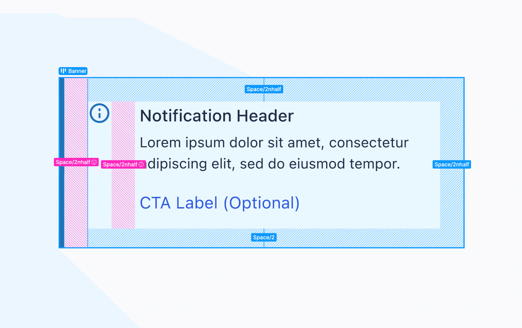
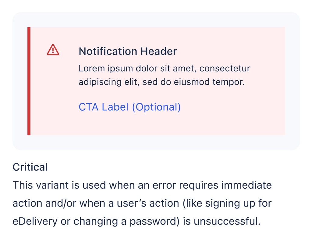
I'm using the banner component as an example of this. It's a standard banner alert with neutral, error, success, and warning states.
Autolayout
It was crucial for every component to be fully configured for auto-layout. Not only were we designing for different device sizes, but we were also designing for accessibility features like large text. This banner component expands and contracts based on the horizontal space available and the length of the text.


Variants and Variables
When organizing variants and toggles, I followed a few guiding principles: limit choices to what the component truly requires, order options by likelihood of use, and favor boolean toggles over variants when possible.
For more complex components, I partnered with a content strategist to organize the information, sometimes conducting internal testing to validate our approach.

Designing the Component
For every component I built, I created two tiers of documentation: concise descriptions embedded within the component, and comprehensive guidance in our design system Figma file.
The documentation evolved through feedback from team meetings, where colleagues would surface edge cases and potential issues. While this iterative approach improved clarity, I struggled to keep the documentation concise as it grew to address each new scenario.


Ensuring Accessibility
It's always important to design with accessibility in mind, and for Northwestern Mutual the need was very present. As a large insurance company, our user-base was large and diverse, trended middle-aged to elderly, and represented a wide array of abilities and disabilities. Sloppy, inaccessible designs genuinely impacted our users, so every component went through a comprehensive accessibility audit.
Tappability
Android requires minimum touch targets of 48dp (density-independent pixels) and iOS requires 44pt (points). In Figma, we set our minimum touch targets to 48px for Android and 44px for iOS components, and provided guidance to engineers about implementing these as dp and pt respectively in production. These touch target requirements were adhered to when designing all tappable icon and button components.


Large Text
I designed all components to remain functional with text sizes up to 200% of the original size. By testing each component with doubled text sizes, I could identify and fix layout issues before they reached users. While visual polish sometimes had to be sacrificed for legibility at larger sizes, this was a worthwhile tradeoff.
The engineering team particularly valued receiving these large-text variations alongside standard designs.


Color Contrast
All components and color tokens were designed to comply with AA color contrast requirements at minimum.
WCAG 2.2 states that User Interface Components that are not available for user interaction (disabled components) are not required to meet contrast requirements.
Despite this, I wasn't satisfied with our disabled text fields. I ended up with the version to the right, which has high contrast help text explaining why the form field is disabled. I built the requirement into the variant.


Impact
The system saved hundreds of design hours and increased consistency across the app. Today, the design system is used for all mobile designs. All designs moving forward have a source of truth regarding consistent type, colors, and components.
30 Designers Impacted
35 Engineering partners Impacted
3 hrs / week / designer saved in Design Review meetings
4 hrs / week / designer saved in Figma
Increased Design Consistency Across Mobile Org
The design system initially evolved to serve the needs of our small, four-person team. After a year, when Northwestern Mutual shifted to a mobile-first strategy, our user base expanded to thirty designers. This transition gave me the opportunity to shape a tool with company-wide impact, and I took pride in creating an onboarding experience that helped mobile designers quickly adopt and contribute to the system.
micahransomtaylor@gmail.com
603-359-3486
micahransomtaylor@gmail.com
603-359-3486
micahransomtaylor@gmail.com
603-359-3486