Financial Accounts
Redesigning Northwestern Mutual's Accounts page to better represent insurance and investments.
My Role
Product Designer
Collaborated With
UX Research, UX Writing, Product, Engineering
Project Duration
8 months, 2023–2024
Status
Live

Net Worth View

Insurance View

Investments View
Net Worth View
Insurance View
Investments View
Net Worth View
Insurance View
Investments View
Net Worth View
Insurance View
Investments View

Net Worth Page
Net Worth Page
Net Worth Page
Net Worth Page
Project Summary
For eight months in 2023 and 2024, I worked on the financial account viewing experience on Northwestern Mutual (NM)'s consumer app and website, improving information architecture and building out detail pages on NM's insurance and investment offerings.
My redesign of Accounts launched in fall 2024, driving a 7x increase in mobile app investments usage and decreasing account detail-related support calls.
The Previous Designs
Accounts was where Northwestern Mutual (NM) clients saw their insurance and investment accounts, but it was also a net worth tracker. Users could connect to external financial institutions and get a summary of their wealth.
The Previous Designs
Accounts was where Northwestern Mutual (NM) clients saw their insurance and investment accounts, but it was also a net worth tracker. Users could connect to external financial institutions and get a summary of their wealth.
The Previous Designs
Accounts was where Northwestern Mutual (NM) clients saw their insurance and investment accounts, but it was also a net worth tracker. Users could connect to external financial institutions and get a summary of their wealth.
The Previous Designs
Accounts was where Northwestern Mutual (NM) clients saw their insurance and investment accounts, but it was also a net worth tracker. Users could connect to external financial institutions and get a summary of their wealth.


The previous Accounts page. Account balances fed into net worth at the top.
The previous Accounts page. Account balances fed into net worth at the top.
The previous Accounts page. Account balances fed into net worth at the top.
The previous Accounts page. Account balances fed into net worth at the top.
Insurance Was Underemphasized
Most insurance policies don't count towards net worth, so on the previous accounts page, most insurance policies were marked with a $-. Important information like death benefits weren't visible without tapping into accounts.
Insurance Was Underemphasized
Most insurance policies don't count towards net worth, so on the previous accounts page, most insurance policies were marked with a $-. Important information like death benefits weren't visible without tapping into accounts.
Insurance Was Underemphasized
Most insurance policies don't count towards net worth, so on the previous accounts page, most insurance policies were marked with a $-. Important information like death benefits weren't visible without tapping into accounts.
Insurance Was Underemphasized
Most insurance policies don't count towards net worth, so on the previous accounts page, most insurance policies were marked with a $-. Important information like death benefits weren't visible without tapping into accounts.

How insurance policies were displayed.
How insurance policies were displayed.
How insurance policies were displayed.
How insurance policies were displayed.
Investment Details Weren't Findable
My colleagues built a focused investments page with insight into portfolio allocation and growth by asset type, but users were having a hard time finding it. The entry point into the whole page was a tiny arrow.
Investment Details Weren't Findable
My colleagues built a focused investments page with insight into portfolio allocation and growth by asset type, but users were having a hard time finding it. The entry point into the whole page was a tiny arrow.
Investment Details Weren't Findable
My colleagues built a focused investments page with insight into portfolio allocation and growth by asset type, but users were having a hard time finding it. The entry point into the whole page was a tiny arrow.
Investment Details Weren't Findable
My colleagues built a focused investments page with insight into portfolio allocation and growth by asset type, but users were having a hard time finding it. The entry point into the whole page was a tiny arrow.

Previous investments entrypoint.
Previous investments entrypoint.
Previous investments entrypoint.
Previous investments entrypoint.
Designing for Web
The website had many of the same usability issues, as well as pressing visual design issues. Different parts of Accounts for web had been designed by different teams, using different design systems.
Designing for Web
The website had many of the same usability issues, as well as pressing visual design issues. Different parts of Accounts for web had been designed by different teams, using different design systems.
Designing for Web
The website had many of the same usability issues, as well as pressing visual design issues. Different parts of Accounts for web had been designed by different teams, using different design systems.
Designing for Web
The website had many of the same usability issues, as well as pressing visual design issues. Different parts of Accounts for web had been designed by different teams, using different design systems.

Previous web empty state.
Previous web empty state.
Previous web empty state.
Previous web empty state.
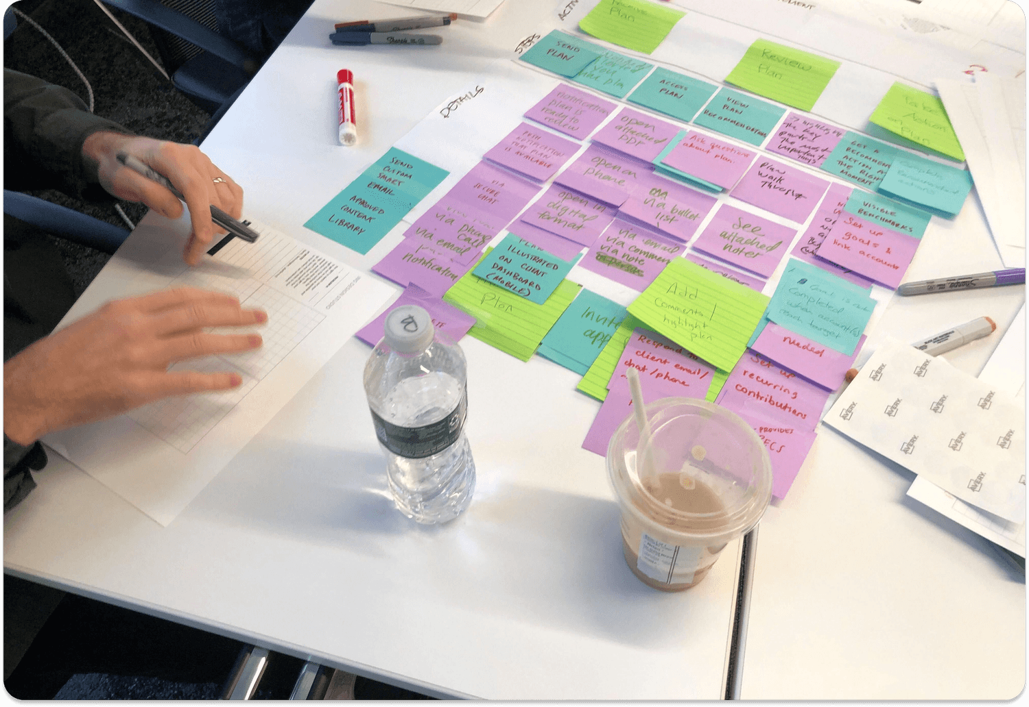
Kickoff Workshop
To better understand the space, my team and I conducted stakeholder interviews then led a kickoff workshop. The workshop combined research reviews, journey mapping, prioritization exercises, and ideation sessions.
Northwestern Mutual is a big company, which made this workshop crucial for getting everyone on the same page. Our most productive time was spent aligning on basic facts and basic goals as a group.
We ran a number of design thinking exercises with stakeholders.
We ran a number of design thinking exercises with stakeholders.

We ran a number of design thinking exercises with stakeholders.
We ran a number of design thinking exercises with stakeholders.
Recently Shelved Redesigns
The following designs were both killed after design handoff in the early stages of development. An internal designer completed the first design, aiming to give clients detailed information on their assets and liabilities. It was deprioritized due to restructuring, and because the company wanted to design mobile first. External design consultants finished the second design, but it failed to solve some of the core usability problems with accounts, and the data visualization didn't resonate with users.

This design was shelved because it focused too much on Net Worth for leadership.
This design was shelved because it focused too much on Net Worth for leadership.
This design was shelved because it focused too much on Net Worth for leadership.
This design was shelved because it focused too much on Net Worth for leadership.


This design's datavis didn't resonate with users, and it lacked a clear value prop.
This design's datavis didn't resonate with users, and it lacked a clear value prop.
This design's datavis didn't resonate with users, and it lacked a clear value prop.
This design's datavis didn't resonate with users, and it lacked a clear value prop.
Net Worth
Net worth was the main cause of our usability issues; NM simply sold too many products without a cash value component. At the same time, Net Worth served two valuable business needs:
People don't check insurance apps. Net worth tracking pushed the majority of our web and mobile usage, with a group of power users (~10% of total) checking net worth multiple times a week.
With user permission, connected account details were shared with NM financial advisors, who used the data to provide personalized financial plans featuring NM products.
With these constraints in mind, my first iteration provided more context to that net worth number, bucketing accounts into assets, liabilities, and insurance.

Asset and liability graph.

Asset and liability categories.
Asset and liability graph.
Asset and liability categories.
Asset and liability graph.
Asset and liability categories.
Asset and liability graph.
Asset and liability categories.
Removing Net Worth
In testing, the above iteration still had some usability issues regarding findability and user understanding. After brainstorming with product and the rest of the team, we agreed that net worth would be better in a different part of the experience, specifically as part of our financial planning interfaces.
This gave me the freedom to focus solely on account findability and scannability. Through removing net worth and introducing a tab layout with insurance, investments, and connected accounts tabs, nearly all of our testers were able to navigate the experience without problems.

Tab layout without net worth.
Tab layout without net worth.
Tab layout without net worth.
Tab layout without net worth.
Restoring Net Worth
At this point in the project, the company's tech org went through major restructuring. Financial planning was deprioritized, meaning we wouldn't be able to move net worth out of Accounts.
I didn't want to lose our usability gains, so I kept the tab layout with focused insurance and investment tabs. I removed the assets and liabilities framework because our users weren't familiar with that terminology, and because I wasn't convinced of the value for the many users without external connected debt.
It was important to ensure that net worth didn't make insurance-only clients feel like second-class citizens. For clients without investments or external accounts, Insurance was the default tab when tapping into Accounts, and the Net Worth tab showed an empty state.

Tab layout with net worth.

Accounts listed beneath graph.
Tab layout with net worth.
Accounts listed beneath graph.
Tab layout with net worth.
Accounts listed beneath graph.
Tab layout with net worth.
Accounts listed beneath graph.
Insurance
There were two main problems with the way that we showed insurance:
Our designs subtly devalued insurance. Most of Northwestern Mutual's business is in insurance, and insurance's role is usually to protect wealth (instead of growing wealth). The net worth framework meant that policies that didn't count towards net worth were implied to have no value.
Clients couldn't see helpful information about their insurance. Accounts didn't have an at a glance summary of insurance benefits, or an easy way to know which policy belonged to who. Many clients told us they kept their own records rather than using our tech.

Previous view of insurance.
Previous view of insurance.
Previous view of insurance.
Previous view of insurance.
Insurance Within Net Worth's Context
My initial fix added the name of the insured and the benefit amount to the main accounts page. This design tested okay - users were able to find policies faster than before, but a few people were confused by all of the different numbers and how they related to net worth.
The main problem with this iteration, in my view, was that insurance was disjointed from the rest of the page. I hadn't implemented the tab layout yet, so trying to jam all of this new information into the existing framework caused cognitive friction for users.

The "bandaid" solution.
The "bandaid" solution.
The "bandaid" solution.
The "bandaid" solution.
Perfecting the Layout
The final insurance tab displayed each person's total coverage across all of their policies. Users could tap on policies for additional details.
Testing revealed that users understood this organization within seconds. Several mentioned that they had manually written out similar summaries for themselves.

The final insurance tab.

Policies were organized by the insured.
The final insurance tab.
Policies were organized by the insured.
The final insurance tab.
Policies were organized by the insured.
The final insurance tab.
Policies were organized by the insured.
Investments
Our users weren't finding the investments page because it was hidden behind a hard-to-find CTA. With new investments features in the works, I needed to make investments easier to find.
Investments
Our users weren't finding the investments page because it was hidden behind a hard-to-find CTA. With new investments features in the works, I needed to make investments easier to find.
Investments
Our users weren't finding the investments page because it was hidden behind a hard-to-find CTA. With new investments features in the works, I needed to make investments easier to find.
Investments
Our users weren't finding the investments page because it was hidden behind a hard-to-find CTA. With new investments features in the works, I needed to make investments easier to find.

Clients couldn't find this entrypoint...

...to access all of this.
Clients couldn't find this entrypoint...
...to access all of this.
Clients couldn't find this entrypoint...
...to access all of this.
Clients couldn't find this entrypoint...
...to access all of this.
Trying Different CTAs
Prior to the tab layout's implementation, I tried putting various CTAs near the investments section of the page. I was genuinely surprised how poorly these tested - even using our bright blue primary CTA, people scrolled right past these entry points.
I didn't want to get caught in an arms race of making louder and louder CTAs, so I thought about how to fix the information architecture of the page itself. This was how I came up with the tab layout: it was a way to elevate investments to its rightful place in the IA.

Clients didn't see this tasteful CTA.

They also didn't find this garish CTA.
Clients didn't see this tasteful CTA.
They also didn't find this garish CTA.
Clients didn't see this tasteful CTA.
They also didn't find this garish CTA.
Clients didn't see this tasteful CTA.
They also didn't find this garish CTA.
Tab Layout Saves the Day
The tab layout was surprisingly fantastic with regard to findability – when clients were asked to find information regarding retirement accounts and brokerage accounts, they tapped straight into "investments" to find what they needed.
To make Investments look like a coherent part of the Accounts tab, I tweaked the visuals to be standard across all three tabs. I upgraded the graph, header, and account visuals, replacing deprecated components with mobile design system components.

The final investments tab.

Only small tweaks to the visuals.
The final investments tab.
Only small tweaks to the visuals.
The final investments tab.
Only small tweaks to the visuals.
The final investments tab.
Only small tweaks to the visuals.
Accessibility
Accessibility guided our design process throughout, incorporating both formal audits and informal design decisions.
To achieve WCAG AAA compliance, we maintained contrast ratios of at least 7:1 for normal text and 4.5:1 for large text. I noticed that our previous global graph style failed to meet the required 3:1 contrast ratio for meaningful graphics. In response, I designed an accessible graph component and worked with engineering to implement it consistently across the app.

Light mode.

Dark mode.
Light mode.
Dark mode.
Light mode.
Dark mode.
Light mode.
Dark mode.
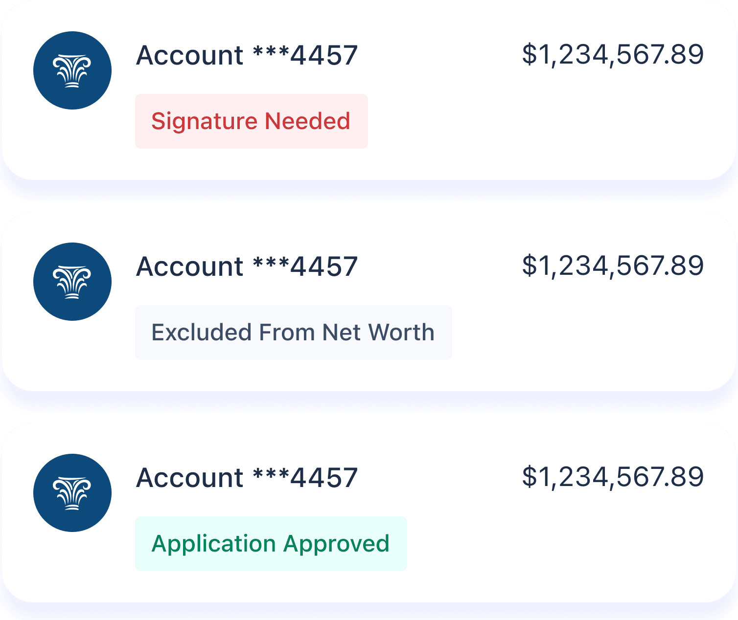
Account States
Over the years, we had created an array of account statuses, signifying all sorts of errors, time since last updated, steps along the underwriting process, and more. These account statuses had been added in piecemeal over the years, so they weren't standardized – we had at least 6 distinct error message styles. I designed a unified style to accommodate all account statuses, reducing complexity and making sure every error, neutral, and success state included explanatory text in a tag.
Standardized error, neutral, and success states.
Standardized error, neutral, and success states.
Standardized error, neutral, and success states.
Standardized error, neutral, and success states.
Large Text
Northwestern Mutual's app supports text scaling up to 200% to accommodate users who need larger type. To ensure both legibility and aesthetics at maximum size, I created reference designs for engineers by doubling font sizes in Figma and adjusting as necessary.
Large Text
Northwestern Mutual's app supports text scaling up to 200% to accommodate users who need larger type. To ensure both legibility and aesthetics at maximum size, I created reference designs for engineers by doubling font sizes in Figma and adjusting as necessary.
Large Text
Northwestern Mutual's app supports text scaling up to 200% to accommodate users who need larger type. To ensure both legibility and aesthetics at maximum size, I created reference designs for engineers by doubling font sizes in Figma and adjusting as necessary.
Large Text
Northwestern Mutual's app supports text scaling up to 200% to accommodate users who need larger type. To ensure both legibility and aesthetics at maximum size, I created reference designs for engineers by doubling font sizes in Figma and adjusting as necessary.

Large text mockup.
Large text mockup.
Large text mockup.
Large text mockup.
The Website
After mobile was finalized and passed to development, I redesigned the web version of Accounts. I wasn't given as much creative license for web; there were specific documents that I had to mirror when building my tables, and the website had a mature design system. Still, there was plenty of work to be done to bring web up to our usability and visual standards.
One note - I didn't do any work on the website's investments page, so I haven't included it in this section.
Net Worth
Net worth was simple to port over to web; I replaced the mobile graph with an out of the box web graph, and the mobile accounts list was changed to a table. I worked with the design systems team to accommodate my standardized error messages within their tables.
The tables on the web version of Net Worth had more datapoints; these were carried over from the previous iteration to avoid removing functionality for existing users.

Web net worth graph.
Web net worth graph.
Web net worth graph.
Web net worth graph.

Web net worth account list.
Web net worth account list.
Web net worth account list.
Web net worth account list.
Insurance
The insurance page I designed differed from mobile in that it intentionally mirrored the standard policy documentation provided to clients. Mobile implementation faced significant usability and scanability challenges when attempting to include all these datapoints. On web, however, these usability impacts were minimal enough that altering the table structure would have created unnecessary legal exposure, as confirmed in discussions with our legal and compliance teams.

Web insurance page.
Web insurance page.
Web insurance page.
Web insurance page.
Additional Screens
The following pages weren't in scope, but we found out very late that for technical reasons, we would have to rewrite them using design system components. I asked my manager for a few more days to rework account detail pages and design an empty state from scratch.
Additional Screens
The following pages weren't in scope, but we found out very late that for technical reasons, we would have to rewrite them using design system components. I asked my manager for a few more days to rework account detail pages and design an empty state from scratch.
Additional Screens
The following pages weren't in scope, but we found out very late that for technical reasons, we would have to rewrite them using design system components. I asked my manager for a few more days to rework account detail pages and design an empty state from scratch.
Additional Screens
The following pages weren't in scope, but we found out very late that for technical reasons, we would have to rewrite them using design system components. I asked my manager for a few more days to rework account detail pages and design an empty state from scratch.

Account detail page.
Account detail page.
Account detail page.
Account detail page.

Empty state.
Empty state.
Empty state.
Empty state.
Mobile Web
The web screens I designed also supported mobile web. Our team's philosophy for mobile web was to use the same components, provide the same functionality, and avoid adding to development time, which did mean compromising on some visual elegance.
Mobile Web
The web screens I designed also supported mobile web. Our team's philosophy for mobile web was to use the same components, provide the same functionality, and avoid adding to development time, which did mean compromising on some visual elegance.
Mobile Web
The web screens I designed also supported mobile web. Our team's philosophy for mobile web was to use the same components, provide the same functionality, and avoid adding to development time, which did mean compromising on some visual elegance.
Mobile Web
The web screens I designed also supported mobile web. Our team's philosophy for mobile web was to use the same components, provide the same functionality, and avoid adding to development time, which did mean compromising on some visual elegance.

Net worth graph.

Table styling.

Modal styling.
Net worth graph.
Table styling.
Modal styling.
Net worth graph.
Table styling.
Modal styling.
Net worth graph.
Table styling.
Modal styling.
Impact
The redesigned Accounts launched in fall 2024, driving a 7x increase in mobile app investment page usage while maintaining Net Worth engagement. While I haven't been able to get data on support calls, user testing sessions showed that clients were able to find their account and policy details more often and faster than before.